Contract Work · 2016
SparkStarter
A Minneapolis-based social dating app that connects people through networks of friends — and the brand identity, wireframes, and screen designs I built for it.
Overview
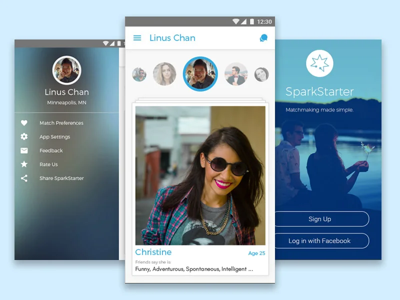
SparkStarter is a Minneapolis-based social dating app that connects people through networks of friends. The initial UI design for the app needed refinement, along with the logo and branding — the task was to create a modern mark that would ultimately define the brand and the design of the app.
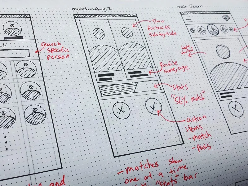
Wireframes and screen designs were needed to guide the development team, and print materials were needed to support the marketing team at PR and launch events.
Branding
The logo is a series of thin, jagged lines that resemble a spark or electricity. The "spark" theme carries through the mobile app itself — it's the visual language used whenever the product needs to tell a user that a match has been made.
The simplicity of the sans-serif wordmark, paired with the refined feel of the mark, creates a modern and youthful brand image that reads well on a phone screen and on a printed banner.
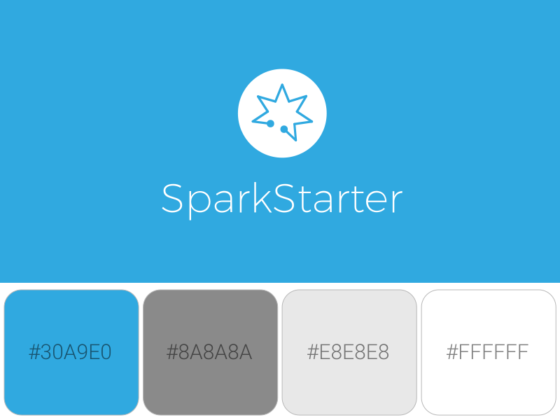


The spark mark isn't just a logo — it's a piece of UI vocabulary. Reusing it as the "you've been matched" moment inside the app means the brand shows up at the exact instant a user feels the product working, not just on the splash screen.
Design rationale
In the Real World
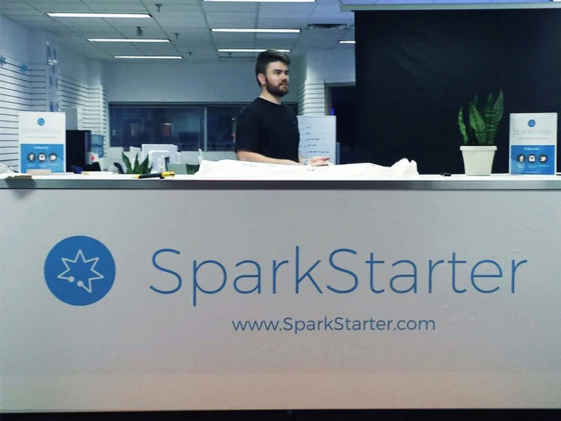
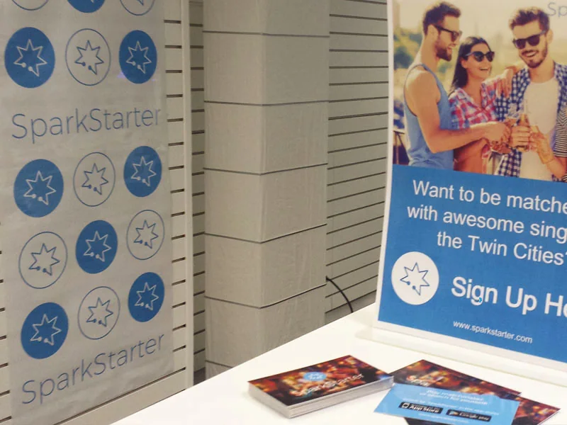
Beyond the app, the identity had to hold up on a trade-show table and a printed banner — signage, business cards, and pull-up banners for local PR events where the team recruited early users in person.
Initial Concepts
We started with rough sketches and wireframes to plan the overall layout and architecture. The challenge was working within limited screen space across multiple interactions — we had to get creative with how large list items were displayed and how swipe gestures were integrated into the matching flow.