Client Work · UX Design · 2018

Coldwell Banker Seller's Page

Redesigning the Home Seller's page to inform and connect home owners to real estate agents.

Role
UX designer
Scope
Heuristic analysis, wireframes, illustration
Platform
Web — desktop & mobile
Tools
Sketch, Illustrator, Google Analytics
01

Scope

There was an opportunity to improve our Home Seller's page — the informational page that connects homeowners with agents. I performed a heuristic analysis and identified several opportunities for UX improvements. The goal was to improve the scannability of the page, add visual intrigue, ensure the page worked on all mobile views, and build confidence with users to reach out if they have any questions.

Our KPIs included pageviews and contact form submissions, which we would measure with Google Analytics. This would be applied to the Coldwell Banker site, which is owned by Anywhere Real Estate (previously Realogy).
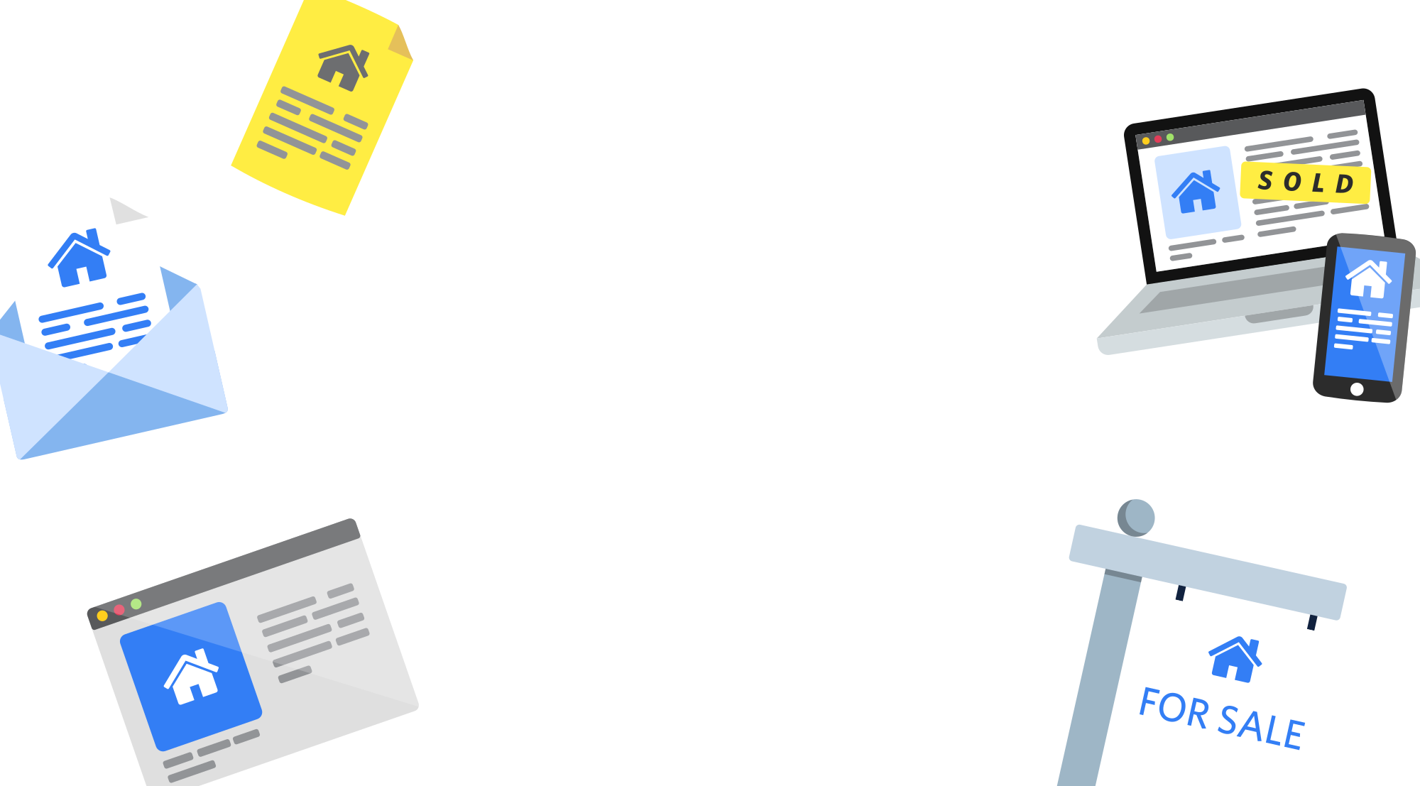
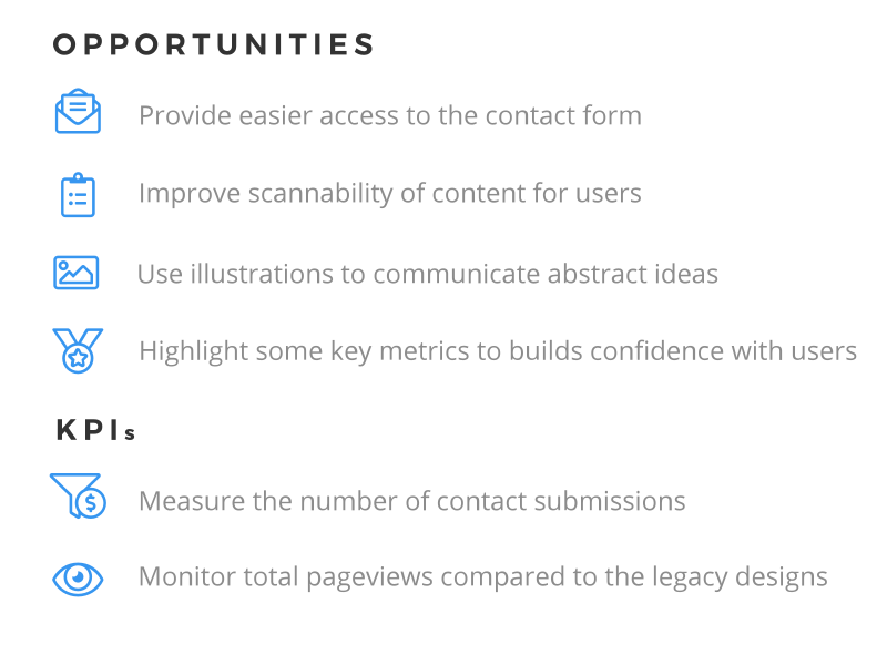
Illustration of four real estate touchpoints: a mail envelope with a home-listing card, a yellow listing document, a laptop and phone displaying a SOLD listing page, and a blue FOR SALE yard sign
Heuristic analysis summary listing four opportunities — easier access to the contact form, improved content scannability, illustrations for abstract ideas, and highlighted key metrics — plus two KPIs: contact submissions and pageviews
02

Structure

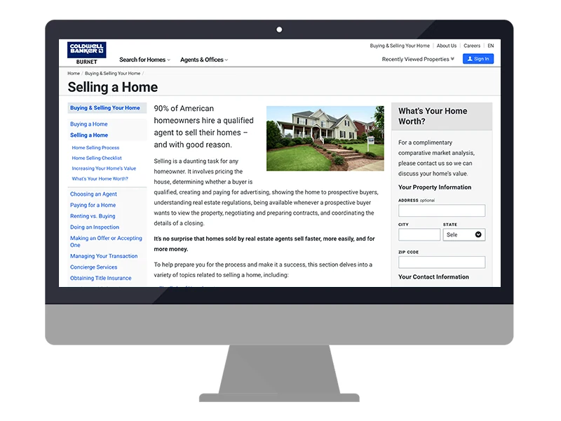
Originally several large blocks of cluttered text, the new page will have summarized information, a modernized look, and an optimized design for mobile. The goal is to improve scannability; the user should be able to glance at the webpage quickly and understand the general concepts.
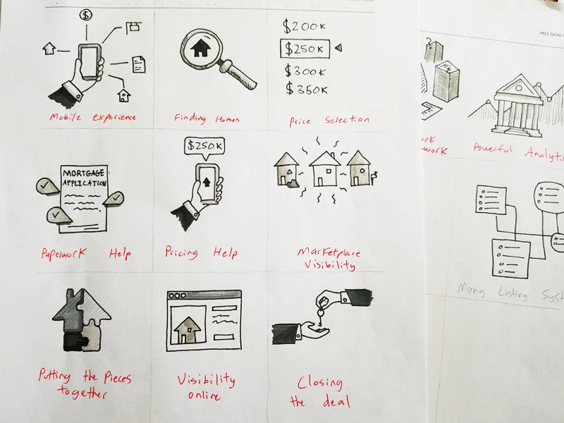
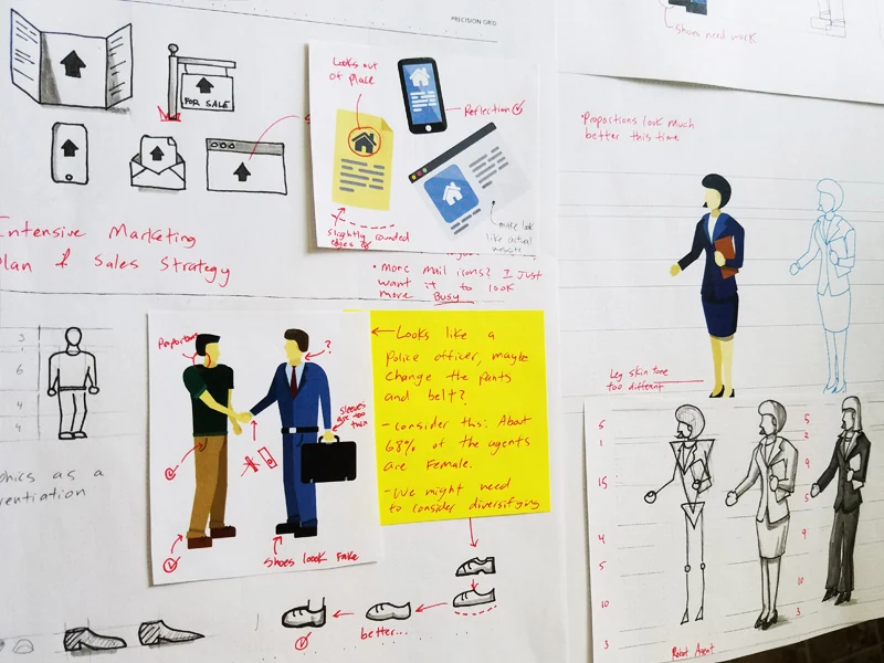
A 3x3 grid of hand-drawn concept icons labeled Mobile Experience, Finding Homes, Price Selection, Paperwork Help, Pricing Help, Marketplace Visibility, Putting the Pieces Together, Visibility Online, and Closing the Deal Sketch page showing an Intensive Marketing Plan icon set (mailbox, browser, phone, for-sale sign), proportion studies for illustrated figures, and an agent-and-client handshake sketch annotated with critique notes about diversifying the characters
03

Illustrations

Illustrations provided a great opportunity to convey complex messages succinctly and meaningfully while being on trend with modern web design. Subtle hints of expression and personality help the information stand out even more in a way that augments the user experience with style and charm.
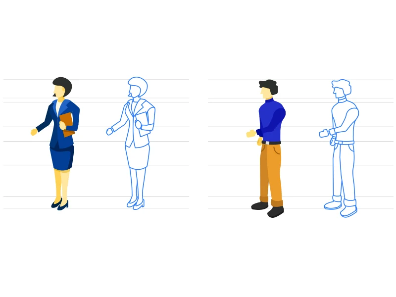

Finished illustration vectors of a female real estate agent and a male homeowner, each shown as a full-color figure beside its blue line-art construction outline on a horizontal proportion grid Finished illustration set: an office building, a phone and a browser icon each showing a home listing, a for-sale yard sign, a listing document, an agent shaking hands with a client, and a single-family house
04

Final Designs

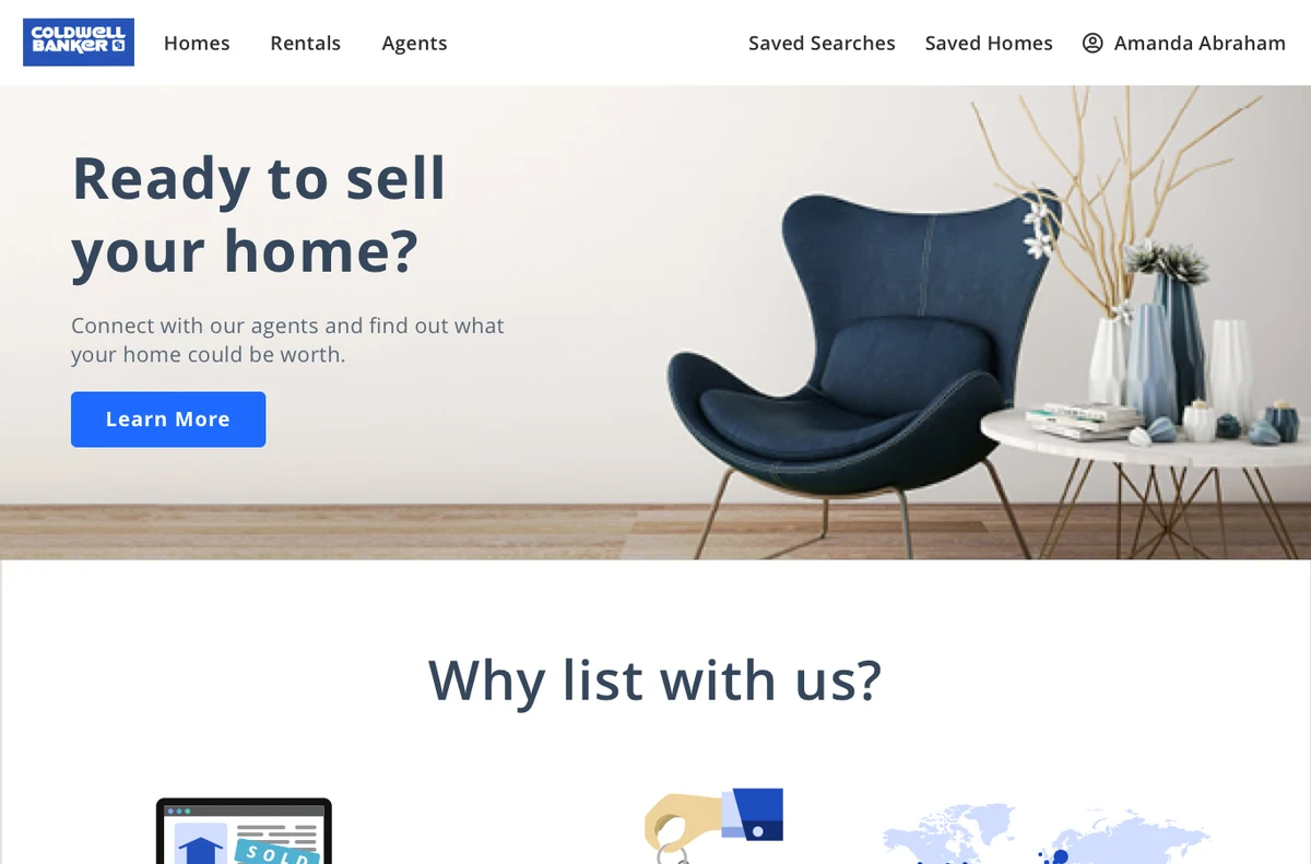
The illustration system, the heuristic findings, and the mobile-first constraints came together into a redesigned page that leads with a clear value proposition and lets people scan their way to the contact form — on desktop and on mobile.
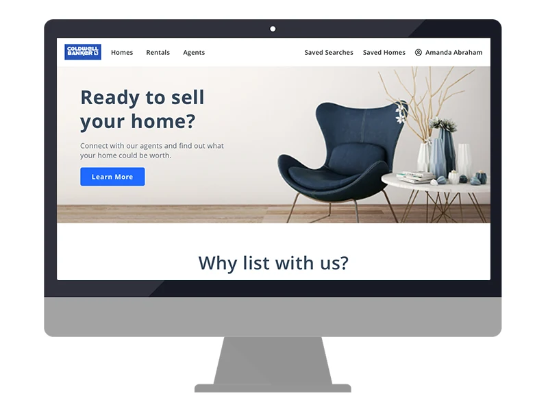
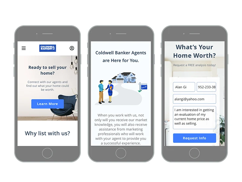
Desktop mockup of the redesigned Seller's page hero: a Ready to sell your home? headline with a Learn More button beside a living-room photo, and the start of a Why List With Us section below Three mobile screens from the redesigned Seller's page: the Ready to sell your home hero, an Agents Are Here for You illustration with supporting copy, and a What's Your Home Worth contact form
The legacy Coldwell Banker Selling a Home page — a left sidebar of text links, a dense paragraph of body copy beside a small house photo, and a plain contact form in the right rail
The shipped redesign in the browser: a Ready to sell your home headline over a living-room photo, followed by the start of the Why List With Us stat row
05

Key Performance Indicators

Early in the project, the product owner and I hypothesized that if we provided users a trustworthy and digestible web page, they are more likely to reach out. I measured the number of contact form submissions and pageviews from 2017 and 2018; the former being the legacy designs and the latter being the new designs. The results speak for themselves.
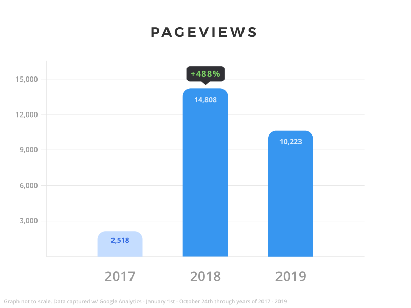
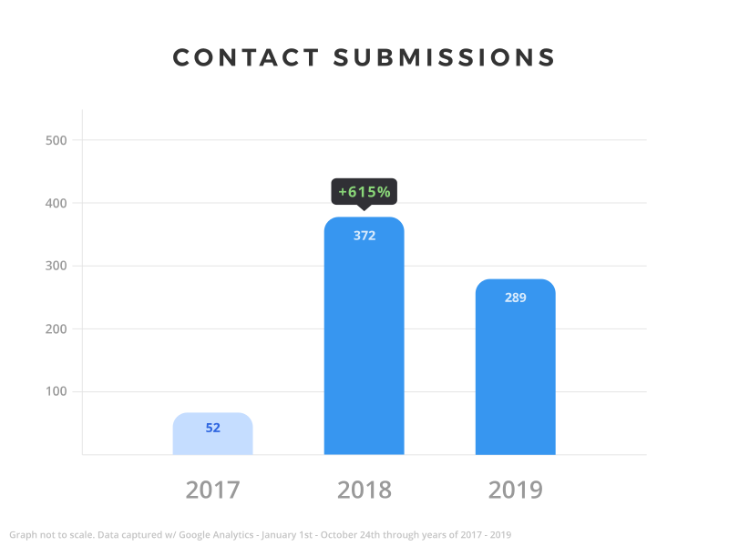
Bar chart titled Pageviews comparing 2017, 2018, and 2019 — 2,518 in 2017 rising to 14,808 in 2018 (a 488% increase after the redesign shipped), then 10,223 in 2019 Bar chart titled Contact Submissions comparing 2017, 2018, and 2019 — 52 in 2017 rising to 372 in 2018 (a 615% increase after the redesign shipped), then 289 in 2019

Wireframes, Designs: Alan Gi
Analysis: Evan Cony, Alan Gi
Development: Nathaniel Allread

Credits

Next Project

Thomson Reuters Onboarding

View project